Hi,
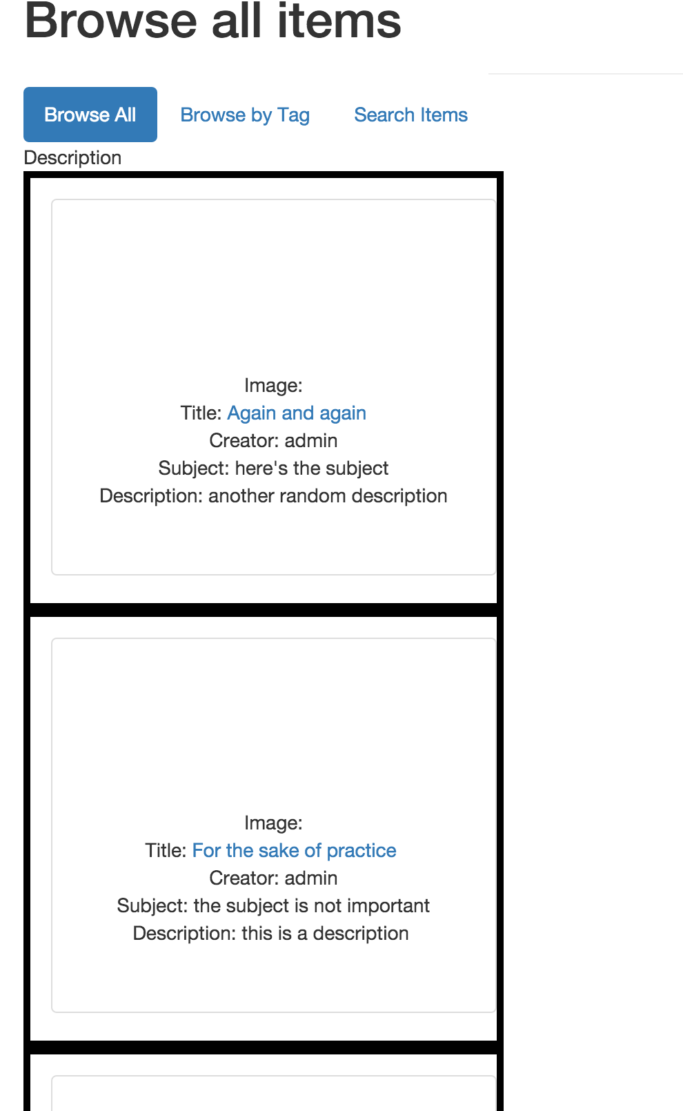
I am making a custom theme that uses Twitter bootstrap. I want to organize my items on items/browse fall into a a responsive grid, each div containing the item information and link to the specific item. However, the divs show up as a single vertical column like this. But I want it to look something like this. I've been trying to figure this out for two days and I am completely stumped!
Here is the partial code on the /items/show page:
<?php foreach (loop('items') as $item): ?>
<div class="container">
<div class="item">
<div class="row">
<!-- attempt at square grid -->
<div class="col-md-3 col-sm-4 col-xs-6 item-item">
<div class="dummy"></div>
<div class="thumbnail purple">
Image: <?php $image = $item->Files; ?>
<?php if ($image) {
echo link_to_item('<div style="background-image: url(' . file_display_url($image[0], 'original') . ');" class="img"></div>');
} else {
echo link_to_item('<div style="background-image: url(' . img('defaultImage@2x.jpg') . ');" class="img"></div>');
}
?>
Title: <?php echo link_to_item(metadata('item', array('Dublin Core', 'Title')), array('class'=>'permalink')); ?>
Creator: <?php echo metadata('item', array('Dublin Core', 'Creator')); ?>
Subject: <?php echo metadata('item', array('Dublin Core', 'Subject')); ?>
Description: <?php echo metadata('item', array('Dublin Core', 'Description'), array('snippet'=>150)); ?></div>
</div>
</div>
</div><!-- end grid -->
And the CSS:
.container {
width: 100%;
height: auto;
display:inline-block;
}.dummy {
margin-top: 100%;
}
.thumbnail {
position: absolute;
top: 15px;
bottom: 0;
left: 15px;
right: 0;
text-align:center;
padding-top:calc(50% - 30px);
}.item-item {
border: solid black 5px;
}